Purple America
Via Electoral-Vote.com (which I’m still reading for some reason), we find another really cool map. This is an animated GIF showing the electoral results by county for every presidential election from 1960 – 2004. It’s called Purple America, and it was created by from Robert Vanderbei from Princeton University.
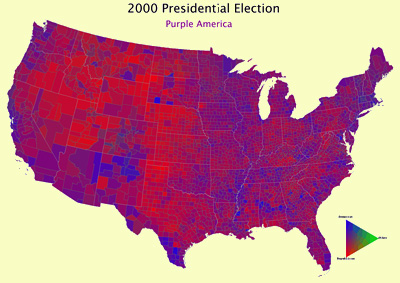
You can watch counties change from blue to red and back again. You can see where Ross Perot and George Wallace had the most support. Or you can squint your eyes and watch the entire country change its shade like a mood ring. Enjoy!
November 13th, 2008 at 5:07 pm
This is soooooo cool…………. It’s disturbing how many counties went for George Wallace. It’s even more disturbing that my MOTHER voted for him… urgh.